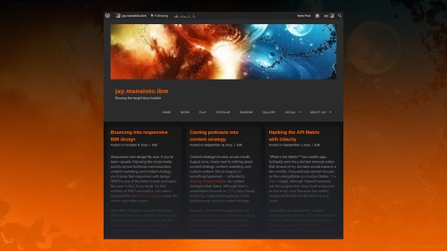
WordPress! In my previous post about responsive web design (RWD), I asked myself, “Will I switch to an RWD template in the future? It’s possible. But I haven’t found the right one yet.” Well, less than two weeks later, I found the start of a workable WordPress theme — the Visual theme by Devin Price. The default wasn’t perfect, but with the proper customizations, it evolved into a satisfying RWD solution.
Why the dark Visual theme? I admit, I’ve avoided “black-on-white themes because their traditional print-based look-and-feel feels too safe or outdated”. So I wanted to find a new light-on-dark theme that could remind me of my old orange-on-black Parament theme yet also infuse a refreshing RWD edge. Although I tried the free Sunspot, Hero, and Isola themes, each showed some irritating oddity.
Hi, my name is Jay, and I’m an IBM TRIRIGA information developer at IBM. Throughout my hours of experiments that compared responsive themes, color schemes, and font families, one theme kept coming back for more while demonstrating the fewest distractions with the greatest impact. Until I finally took the leap — a customized orange-on-black Visual theme. Thanks, Parament. Hello, Visual!
What are the differences between Parament and Visual?
First, the obvious difference and my primary reason for switching WordPress themes is the shift from the basic adaptive web design (AWD) to the more elegant RWD. While Parament displays its unique orange-on-black design in desktop view, it displays the standard yet disjointed blue-and-white design in mobile view. Meanwhile, my customized Visual displays a unified design in both views.
Second, another significant difference is the simplification from the slight shadowed 3D appearance in the Parament desktop view to the flat 2D appearance in the Visual desktop view. As a result, coupled with the removal of skinny 1-pixel borderlines, there’s a stronger impression of crispness, even openness and lightness. Meanwhile, the Visual mobile view retains the same 2D crispness.
Finally, the last major difference is the introduction of the Visual triple-column home page. Although I cut the number of side-column widgets from 11 to 9 and tweaked the widget colors and layouts to better fit the Visual theme, these widgets only appear in the individual posts and pages. By design, they don’t appear in the home page at all. Which enhances the triple-column impact even further.
What are my final thoughts?
How do I like my new Visual theme? After carefully customizing the color scheme, font families, and widget configurations, and reluctantly accepting a few formatting issues in the Gallery and Recent Comments widgets, I’m loving the theme more and more. Just in time for the first anniversary of my tech blog next month. Will I find an even better theme? Haha, maybe for the second anniversary!
Related articles
- Responsive Web Design (www.alistapart.com)
- Responsive Web Design (msdn.microsoft.com)
- DITA and Information Architecture for Responsive Web Design (www.dclab.com)
- RWD is key to getting reluctant mobile shoppers to buy (www.fiercemobileit.com)
- Mobile apps are leaving Web work in the dust, code guru laments (www.cnet.com)


