
Responsive web design! By now, if you’ve been casually following the social media activity across technical communication, content marketing, and content strategy, you’ll know that responsive web design (RWD) is one of the hotter trends and topics this year. In fact, if you recall, my first mention of RWD was back in July when I reviewed the IBM Service Engage portal. My review was rather mixed.
Since then, I began to wonder how other IBM and IBM-partner websites have tackled, or not yet tackled, RWD. After all, websites “that are designed to be swipe-friendly on a mobile browser might not necessarily be scroll-friendly on a desktop browser”. The exploration was enlightening. While some of you might applaud my praises, others might heckle my harsher criticisms. Just being honest.

IBM Design
Hi, my name is Jay, and I’m an IBM TRIRIGA information developer at IBM. With the eyes of a casual surfer, I’m going to sail through a handful of websites, and gently pull on them until they either fall apart or bounce back into place. Will IBM websites do well or poorly? Will IBM-partner websites do better or worse? Will RWD save websites from mobile-app domination? Let’s see what happens.
What is responsive web design?
For those of you not yet familiar with RWD, here are two articles by Wikipedia and Econsultancy.
- Wikipedia: Responsive web design (03 Oct 2014)
Responsive web design (RWD) is a web design approach aimed at crafting sites to provide an optimal viewing experience—easy reading and navigation with a minimum of resizing, panning, and scrolling—across a wide range of devices (from mobile phones to desktop computer monitors).
A site designed with RWD adapts the layout to the viewing environment by using fluid, proportion-based grids, flexible images, and CSS3 media queries, an extension of the @media rule.
I like the clear distinction of defining AWD as using server side techniques to customise the assets/contents served based on device/browser and RWD as using client-side, or browser-based, techniques…
Adaptive web design will typically use a completely different set of designs and templates for each platform being targeted. As a result, designers will create a desktop version of a website and will then design a separate mobile version…
Responsive web design on the other hand comprises of a single design with a fluid layout that adjusts to screen width of the device, meaning that only one set of page templates need to be created and maintained…
The easiest way to determine if a layout is responsive is to view the site on a desktop computer and re-size the browser window, if the layout re-flows and changes relevant to the width of the browser window, you can be fairly sure the site you are looking at is responsive.
What are some good IBM examples?
Now that we’ve dispensed with the pleasantries, let’s dive into the examples. Since I’ll be comparing and contrasting the home pages of IBM portals, platforms, and partners, it makes sense to start with the IBM home page itself. In other words, I’ll be comparing apples to apples, no iPhone pun intended. While responsive web design is our focus, we’ll also see attempts at adaptive web design (AWD).
IBM
First, when we visit the IBM home page (US English) and compare its desktop and mobile versions, we clearly see the separate “m dot” mobile design that identifies AWD. Whatever the logistical reasons are for choosing the AWD approach, both versions look cramped if not cluttered. Meanwhile, despite the reuse of images, there’s a subtle sense of disjointedness between the two versions.

IBM (desktop)

IBM (mobile)
IBM Design
Next, compared to the IBM home page, the IBM Design home page is immediately engaging and elegant. In both the desktop and mobile versions of its RWD approach, there’s a sense of lightness and openness that isn’t encumbered by tight margins or black lines. Its use of simple yet colorful backgrounds also breathes a freshness that escapes the old-school print-based white background.

IBM Design (desktop)

IBM Design (mobile)
IBM MobileFirst
Like the IBM Design home page, the IBM MobileFirst home page implements a similarly striking RWD approach. While its initial stark impact isn’t as immediately engaging, it gradually feels more human and welcoming as you move down the page. Still, there’s the sense of lightness, openness, and crispness that breaks away from the cramped or cluttered feeling of the main IBM home page.

IBM MobileFirst (desktop)

IBM MobileFirst (mobile)
Overall, while the main IBM home page doesn’t yet embrace the RWD approach, it is still a good example of an AWD solution where its mobile version fulfills its purpose with minimal zooming or panning adjustments. By comparison, the IBM Design and IBM MobileFirst home pages are ideal examples of the RWD approach. Sadly, few IBM websites have reached this level of RWD thus far.
What are some poor IBM examples?
Now that we’ve explored a few good IBM examples of AWD and RWD, let’s take a look at a few poor ones that don’t implement adaptive or responsive web design at all. Or at least, not yet. While I can only speculate on the reasons why not, it might still be fun to try. So whether the website runs on an outdated, ill-configured, or inflexible platform, we’ll see how it can impact our mobile experience.
IBM developerWorks
When we visit the Real Estate and Facilities Management website on IBM developerWorks, we quickly see that its mobile version is simply a miniature desktop version. Like the main IBM home page, it looks cramped or cluttered with its tight margins and black lines. But worst of all, in mobile view, its blog pages can’t zoom out to their full widths. You’re forced to pan left and right endlessly.

IBM developerWorks (desktop)

IBM developerWorks (mobile)
IBM Knowledge Center
If you’ve been following me long enough, you’ll know that I’m not a big fan of the IBM Knowledge Center. As early as December 2013, I recognized “its glaring lack of socio-mobile flexibility and community potential” and boldly predicted that “within the next 5-to-10 years, IBM will be forced to migrate its product information once again — to a more-flexible ‘social documentation’ platform.”
But in terms of its AWD or RWD approach, or lack thereof, its mobile version is horribly unusable. Because its mobile version is simply a miniature desktop version, navigating through its miniature product hierarchy is painfully tedious. Even if you bypass the hierarchy with its product search, the lack of a mobile design forces you to zoom in and out as endlessly as panning left and right. Ugh.

IBM Knowledge Center (desktop)

IBM Knowledge Center (mobile)
IBM Bluemix
While it might be forgivable from a new offering, the IBM Bluemix website is decidedly schizophrenic in its mobile design. If you select the Platform area, its mobile version switches to a pleasing RWD. But if you select the Support, Answers, or Community area, its mobile version is simply a miniature desktop version. Luckily, the larger fonts and wider spaces mitigates the potential mobile issues.

IBM Bluemix (desktop)

IBM Bluemix (mobile)

IBM Bluemix (mobile)
Overall, of these 3 IBM examples, the IBM Knowledge Center offers the poorest mobile experience. But oddly enough, by peeking at their respective address bars — whether the security status is green or yellow — the IBM Knowledge Center offers the most-secure experience. Nevertheless, superior security doesn’t make up for a poor mobile experience. Addressing this issue deserves top priority.
What are some IBM partner examples?
Although we’ve sailed through some of the good, the bad, and the ugly IBM examples, many folks might consider this next round to be the main event — the websites of IBM TRIRIGA partners! But just because our IBM TRIRIGA partners might be smaller than IBM, that doesn’t necessarily mean that their websites must look or feel smaller too. Did they apply responsive web design? Let’s see.
CFI
First, when we visit the CFI home page, we quickly see that its mobile version is simply a miniature desktop version. Sadly, this identifies a lack of either AWD or RWD approach. While its hero-image layout might remind us of the IBM home page, its over-reliance on a safe white background suggests a lack of boldness. Instead, I’d love to see wide backgrounds in varying shades of its unique purple.

CFI (desktop)

CFI (mobile)
EBUSINESS STRATEGIES (Ebiz)
Next, the EBUSINESS STRATEGIES home page shares many of the same issues as the CFI home page. Without an AWD or RWD mobile approach or a bold color scheme, the desktop and mobile versions look and feel as unengaging and impotent as the CFI website and IBM Knowledge Center. Even worse, the white transparency turns the background image into annoying gray smudges.

EBUSINESS STRATEGIES (desktop)

EBUSINESS STRATEGIES (mobile)
eCIFM
At last, when we visit the eCIFM Solutions home page, we clearly recognize the separate desktop and mobile designs that identifies AWD. Despite the sense of disjointedness between the two versions, the AWD mobile approach avoids the tedious zooms in and out and pans left and right. Also, unlike CFI and EBUSINESS, eCIFM isn’t afraid to add a bold splash of background color.

eCIFM (desktop)

eCIFM (mobile)
Tango
On a discouraging note, I originally planned to include Tango Management Consulting & Analytics as the third IBM TRIRIGA partner instead of EBUSINESS. Unfortunately, when I performed the Google search over the weekend, Google flagged the Tango result with “This site may be hacked.” After several frozen or failed attempts, I avoided the site and replaced it with EBUSINESS STRATEGIES.

Tango (desktop)

Tango (mobile)
Overall, I’m forced to admit that these 3 examples of IBM TRIRIGA partner websites offer mediocre if not poor mobile experiences. I’m also forced to admit that none of them applied an RWD approach. Consequently, whether or not they have the resources to develop an RWD solution, the lack of one might be costlier in the long run. Is RWD required? No, but it can revive a stale mobile impression.
What are some documentation-based IBM examples?
Now, personally, for me as an information developer, this final round of IBM examples might be the real main event — the documentation-based IBM websites! By now, we can likely expect anything from the good, to the bad, to the ugly. Did they apply an RWD approach? We’ll see. But if it looks like I’m being harsh, I’ll just remind myself that if I can see these issues, then others can see them too.
IBM Knowledge Center
Earlier, I expressed my disappointment with the IBM Knowledge Center in terms of its non-existent AWD or RWD mobile approach and its uninspired color scheme. As a result, “the desktop and mobile versions look and feel… unengaging and impotent”. But its poor web design isn’t its biggest flaw. Instead, its biggest flaw is the assimilation of over 650 infocenter libraries into 1 titanic super-library.
IBM Knowledge Center (desktop)

IBM Knowledge Center (desktop)

IBM Knowledge Center (desktop)
IBM Knowledge Center (mobile)
IBM Bluemix Docs
Next, from the poorest example, we skyrocket to the most striking example — the IBM Bluemix Docs website! Despite the “schizophrenic” nature of the overall IBM Bluemix website, if you select the Platform area, its mobile version switches to a pleasing RWD. Even better, when you reach the Docs area, its RWD approach delivers tight integration, bold innovation, and fantastic flow. Its Docs rock!
For example, my favorite element of the desktop version is its “continuously flowing” topic navigation. I love how the panel shifts right or left as you flow through the topic hierarchy. Also, with my DITA experience, I expected each topic link to represent a separate HTML page. But instead, I found that groups of topic links might also be topic “bookmarks” within the same continuous HTML page. Wow!
Naturally, with this RWD approach, its mobile version carries the same striking look, feel, and flow. Unlike the main IBM home page, there’s no “sense of disjointedness between the two versions”.

IBM Bluemix Docs (desktop)

IBM Bluemix Docs (desktop)

IBM Bluemix Docs (desktop)

IBM Bluemix Docs (mobile)
IBM Mobile Push Docs
Finally, when we visit the IBM Mobile Push home page and select the Docs area, we see the IBM Mobile Push Docs website. Like much of the IBM Bluemix website, there is no AWD or RWD, but “the larger fonts and wider spaces mitigates the potential mobile issues”. Yet, for an odd detour, the Xtify Developer Documentation website still retains its pre-acquisition Xtify design. I’m not quite sure why.
Nevertheless, my favorite element of the IBM Mobile Push Docs website is its social-media-style user icons. For example, I like how the user icon of “Kristina P” adds a nice and engaging personal touch.

IBM Mobile Push Docs (desktop)

IBM Mobile Push Docs (desktop)

IBM Mobile Push Docs (desktop)

IBM Mobile Push Docs (mobile)
Overall, by comparing these 3 documentation-based IBM examples, it’s easy to see how engaging and effective an RWD approach can be. It’s also easy to see how a tight integration between the application and documentation can be far more natural and powerful than tossing the documentation into a detached and disconnected super-library. Finally, a social-media style can add some humanity.
What are my final thoughts?
At the top of this article, I asked, “Will RWD save websites from mobile-app domination?” I asked this because in a previous post, I asked a similar question, “If the onslaught of mobile apps forces the retirement of topic-based websites in 7 years, will IBM be ready in time?” In other words, in the battle for mobile supremacy, websites represent the old guard while mobile apps represent the new guard.
Right now, the best defense for desktop websites — and thus standalone web browsers — to stay relevant in our mobile society is to pursue reflowable and responsive web design. Meanwhile, the best offense for mobile apps — and thus mobile devices and app stores — is to outrun the evolution of web browsers and outgun their processing power. As it stands, websites might lose this battle.
What can IBM do? Since IBM probably fits the old guard of website design more than the new guard of mobile-app design, there’s no reason it can’t continue to pursue RWD with a head-on assault and hedge its bets with mobile-app tactics on the side, like the IBM MobileFirst for iOS partnership with Apple. How does this affect web or mobile-app developers? To be blunt, they’ll have to choose sides.
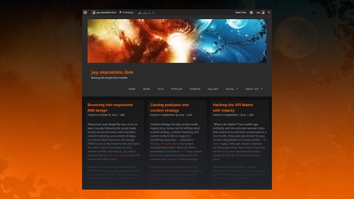
Some of you might be saying, “Your WordPress template applies AWD not RWD. Aren’t you being hypocritical?” I suppose you can interpret it that way. But at the time, I grew fond of the orange-on-black desktop theme. It was free, it was quick, and it got the job done. To this day, I still love its edge. Will I switch to an RWD template in the future? It’s possible. But I haven’t found the right one yet.
Genius
Do I see anything on the horizon? Definitely! One yellow-on-black website that recently grabbed my attention is Genius, once known as Rap Genius: “What is Genius? Genius breaks down text with line-by-line annotations, added and edited by anyone in the world. It’s your interactive guide to human culture.” In a nutshell, if Wikipedia is “social documentation”, then Genius is “social annotation”. Wow.
Naturally, I love the edgy yellow-on-black theme. If you hadn’t noticed already, I tend to criticize black-on-white themes because their traditional print-based look-and-feel feels too safe or outdated. Of course, there are exceptions with fascinating or engaging content, but those are special cases. Meanwhile, with Genius, its hook is its fascinating and engaging annotations of existing publications.
For example, if I select the Tech area, I see the Tech Genius home page. If I dig deeper into the articles, I find Satoshi Nakamoto’s original white paper on Bitcoin. In the paper, I’m free to explore the various annotations — and author-verified annotations — for specific technical concepts. Although the website applies AWD not RWD, the similarity between desktop and mobile designs is striking.
In fact, like WordPress and Wikipedia, Genius offers a mobile app to make up for its occasional or universal lack of RWD. In this light, if a content-editing “social documentation” approach — like my old TRIRIGAPEDIA experiment — is too extreme to save the IBM Knowledge Center, will a content-preserving “social annotation” approach be the next best option? Maybe not, but it might be fun to try.

Genius (desktop)

Genius (desktop)

Genius (desktop)

Genius (mobile)
Podcast
Last but not least, it’s time for my next Jay@IBM podcast! So sit back, multitask, and enjoy the show!

Jay@IBM Podcast
Jay@IBM Podcast
- 00:16 “Hi there! This is Jay@IBM. Thanks for dropping by.”
- 00:48 “One of them that really stood out was the Bluemix Docs website.”
- 02:51 “There’s no 1-to-1 correspondence which is what I liked.”
- 03:20 “In fact, thinking back to a recent topic that Mark Baker wrote about.”
- 04:49 “That’s one of the properties of Mark’s EPPO. Self-containment.”
- 06:28 “So I didn’t see that social-media element in this Bluemix Docs.”
- 07:27 “But the second thing I touched upon in my post is Genius.”
- 08:23 “But you can annotate, add a note, and expand upon it.
- 09:20 “Knowledge Center might be too late, it might be too far gone to help.”
- 10:18 “I’m using social documentation versus social annotation.”
- 10:51 “Let me make a little bit of a reference to the Mobile Push Docs.”
- 12:05 “So if I had to take these 3 things and create the ideal documentation.”
- 14:18 “I don’t know how far this would be in the future for IBM.”
- 15:07 “I hope these ideas made you think or rethink content in general.”
- 15:59 End.
Do I have an update?
Less than 2 weeks after bouncing into responsive IBM design, I bounced into responsive WP design!
Visual theme (desktop)
Later, 7 months after bouncing into responsive IBM design, I poured Polymer onto TRIRIGA docs!

Polymer Topeka Demo
Related articles
- Responsive Web Design (www.alistapart.com)
- From features-first to user-first (www.ibm.com)
- Responsive Web Design (msdn.microsoft.com)
- What is IBM Bluemix? (www.thoughtsoncloud.com)
- DITA and Information Architecture for Responsive Web Design (www.dclab.com)
- RWD is key to getting reluctant mobile shoppers to buy (www.fiercemobileit.com)
 jay.manaloto.ibm
Pingback: Pouring Polymer onto TRIRIGA docs | jay.manaloto.ibm